
History
At our software testing company it is crucial to find the exact scope of testers that is suitable to test our clients’ products. Our client might want to have results based on age, gender, location, but the device used by our testers is just as important. To be able to effectively filter to the user type, the PM-s are using the Slot Manager, which was built to do two things:
- Search for testers with defined criteria, called constraints.
- Invite testers in a clever way so that the target amount of testers who should participate in a test will get invited.
The tool was built a decade ago, and it was time to rebuild it with new technology, detect pain points and improve the workflow of the PM-s, as they use it extensively in their day-to-day work.
Problem Statement & Research
Issues and paint points were collected from PM-s about the editor. It was clear that the outdated Boostrap technology had to be replaced, and the usability of the tools had to be improved.
From interaction point of view, two parts can be differentiated at the tool:
List View
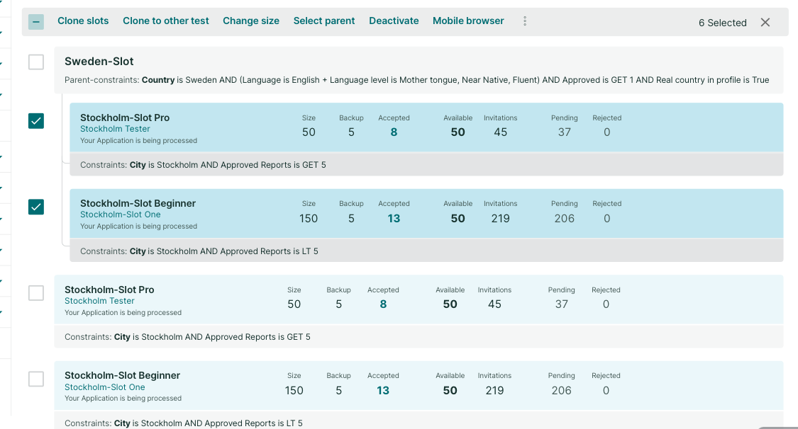
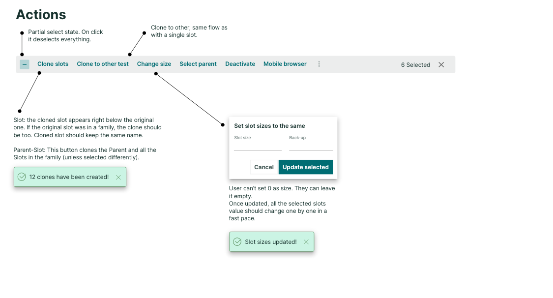
- Missing or inefficient bulk actions
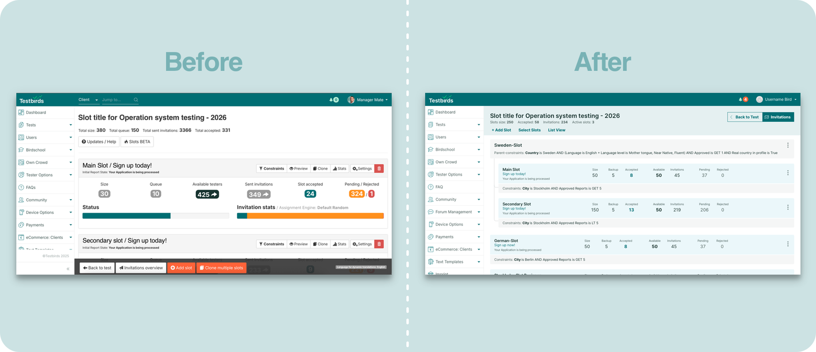
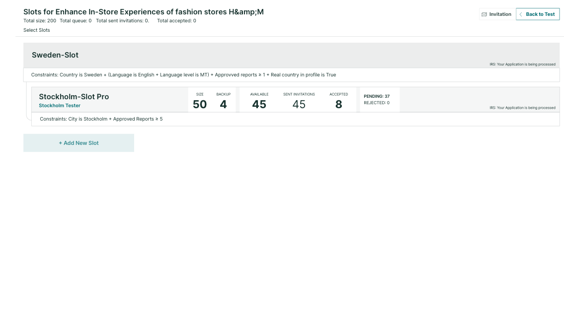
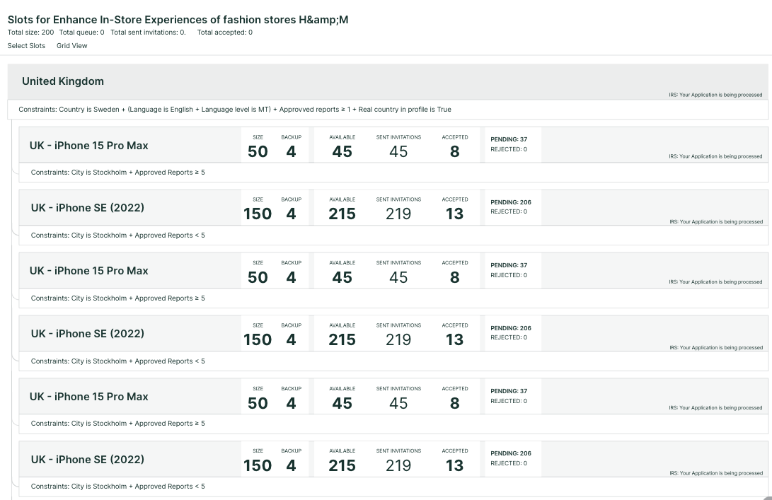
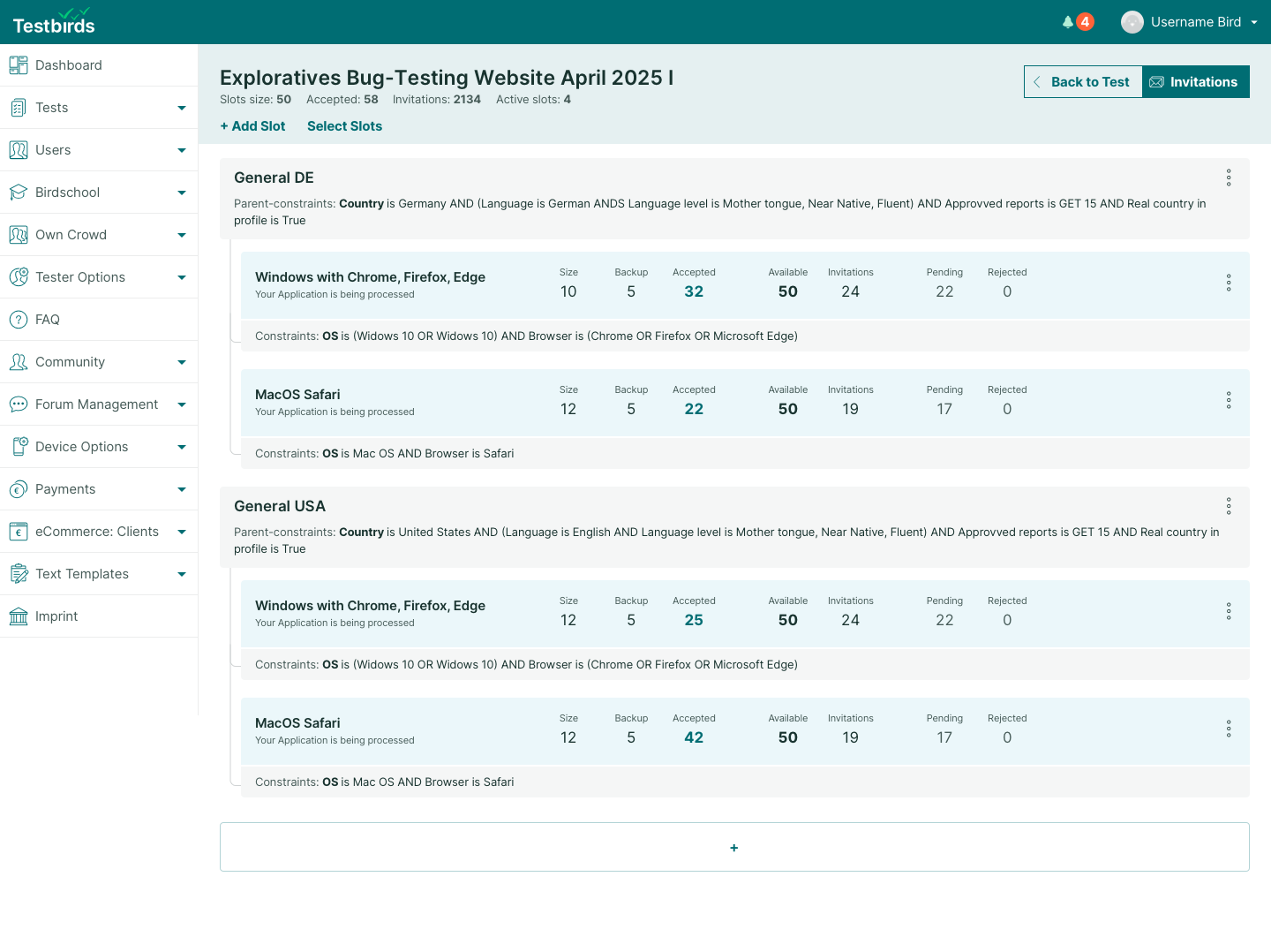
- Oversized list entries, hard to scan
- Constraints not visible in list, causing confusion
- High-level settings on separate page, forcing back-and-forth navigation
Constraint Editor
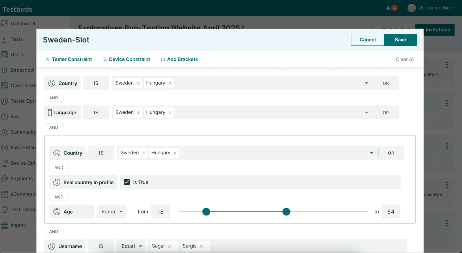
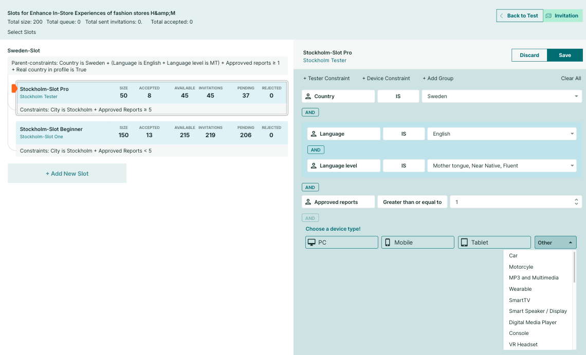
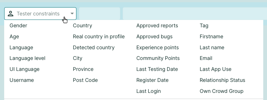
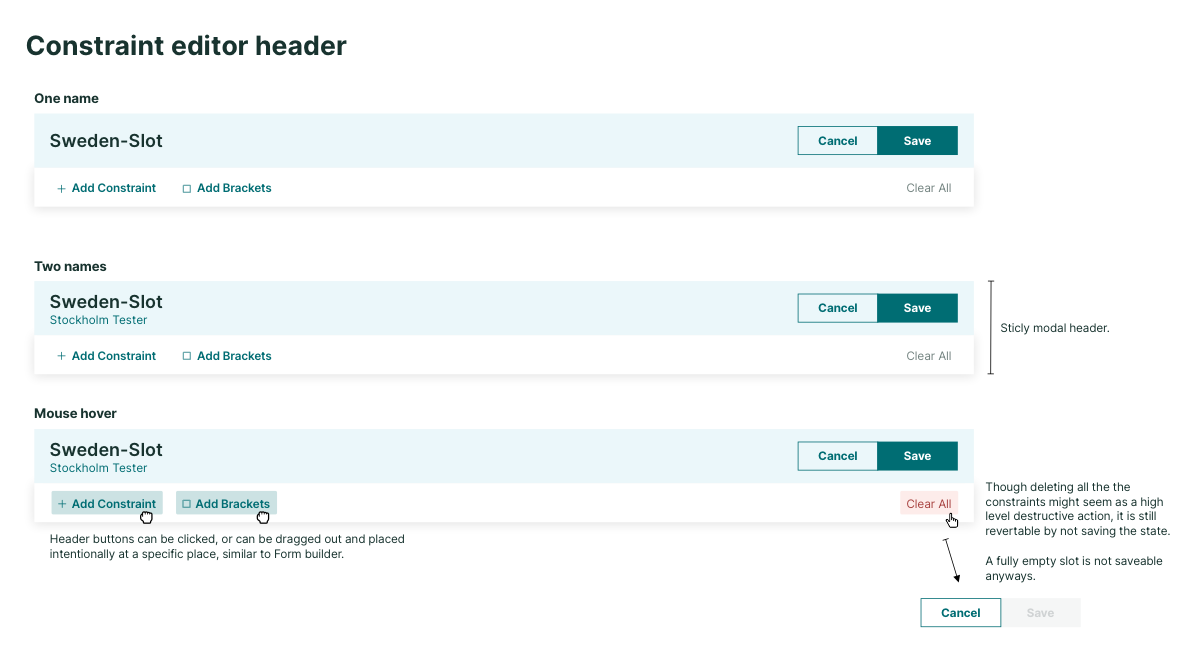
- Complex boolean logic builder
- Confusing terminology
- Complicated saving process
- Hard to get an overview of settings
- Lacked best practices seen in other tools
Unmoderated Usability Test
An extensive undmoderated user testing also took place, where each participants had to create the same complex slot system, for multiple nationalities, genders segments and device types. Even though every PM were able to achieve the given task of building a complex system, their workflow was slowed down due to usability issues and user mistakes due to forgetting certain parts. Through the recording the following issues were detected:
Key Findings from Recordings
Decrease the need for manual adjustments for less error prone mistakes. As the list of slot got increased, more user issues occurred.
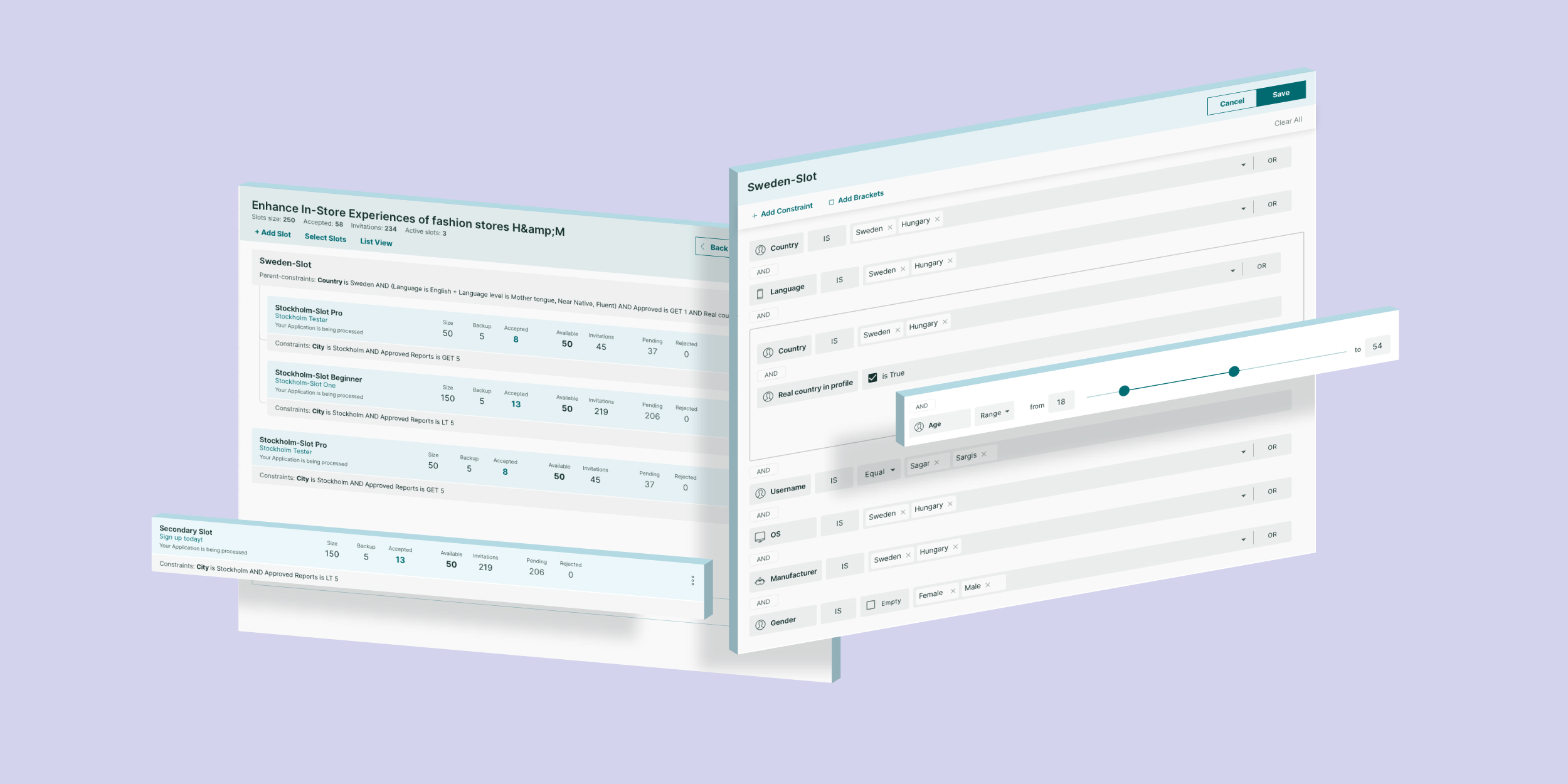
Provide a pracitcal overview so that all slots are easy to grasp in a glance. In the list of slots only titles and values were visible, but the constraint logic not.
Improve the cloning flow of the slots. Clones were just there with the same name, causing confusion
Improve the constraint editor, terminologies, ability to do bulk action more efficiently.
The Goal of the Redesign
Update Technology
Migrate from Bootstrap to React
Improve Usability
Align to React style guide
Advanced Editing
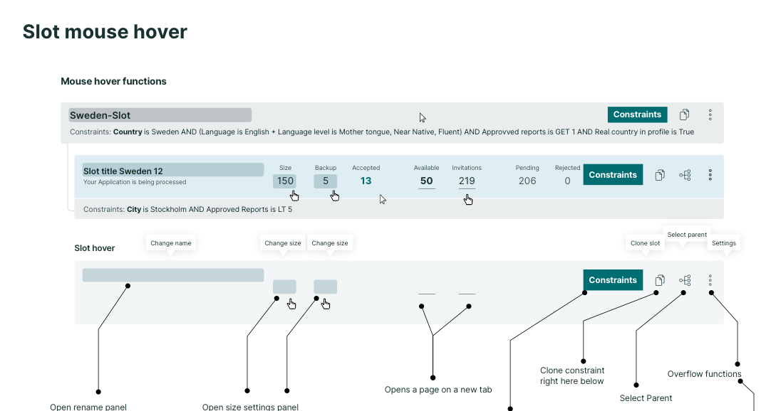
Improve the usability by introducing better bulk action and inline editing
Simplify Constraints
Make the constraint editing more intuitive, easier to overview
Improve Workflow
Reduce user errors for PMs
Ensure Compatibility
Maintain backward compatibility
Design Process
It is crucial to not rush ahead, and design thoroughly by understanding the existing feature in its depths. It is one thing to process user insights and pain points. As backward compatibility is an important factor, the design had to follow the structure, and not reinvent that. The redesigned tool not gonna be able to do new things on a backend level, but on the front end side the interaction and workflow going to be greatly improved.
Being a designer in a way is being a connection point between these different stakeholders.
Steps:
- Kick-off meeting and topic collection
- Analyze unmoderated recordings of PM
- Low-fidelity plans introduction to PMs
- Align technical feasibility with developers
- Hi-fi design plans and click prototype testing with PMs
- Align with dev team again
- Detailed plans, use case discoveries, sprint planning
- Development phase
- Rounds of refinement, fine-tuning, and debugging
Low-fidelity plans
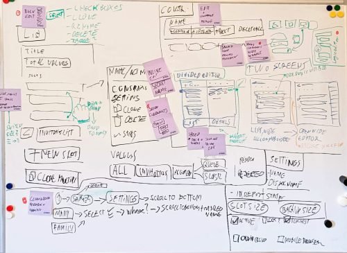
After collecting all insights, the challenge at this point to put everything onto the “canvas”. Even though UI ergonomics is not a factor at this stage, but the layout should somewhat resemble the intended goal, especially size-wise.
I collected several feedbacks from the end-users, the PM-s regarding information relevance, day-to-day habits, and preference.
Early discoveries, initiating discussions
After PM feedback, we created a high-fidelity plan and reviewed it with developers using a click-prototype. This helped uncover technical and backend limitations early, avoiding later surprises.
One key finding was the divided editor concept. While PMs liked it, developers highlighted issues:
- Scaling: Layout fits poorly on smaller screens
- Saving: Constraints must save slot by slot, not globally
- Practicality: Wide modal windows offer better ergonomics
- Stability: Native modal components are more reliable than custom solutions
Due to these factors, the divided editor—despite being a beloved idea—was ultimately rejected. This was a positive outcome.
Testing and discussion prevented wasted development time and ensured we focused on practical, scalable solutions.
High Fidelity plans and testing
The goal of the high-fidelity prototype was to create a layout close to development-ready while leaving room for adjustments. It covered key user flows:
- list view
- bulk actions
- constraint editor
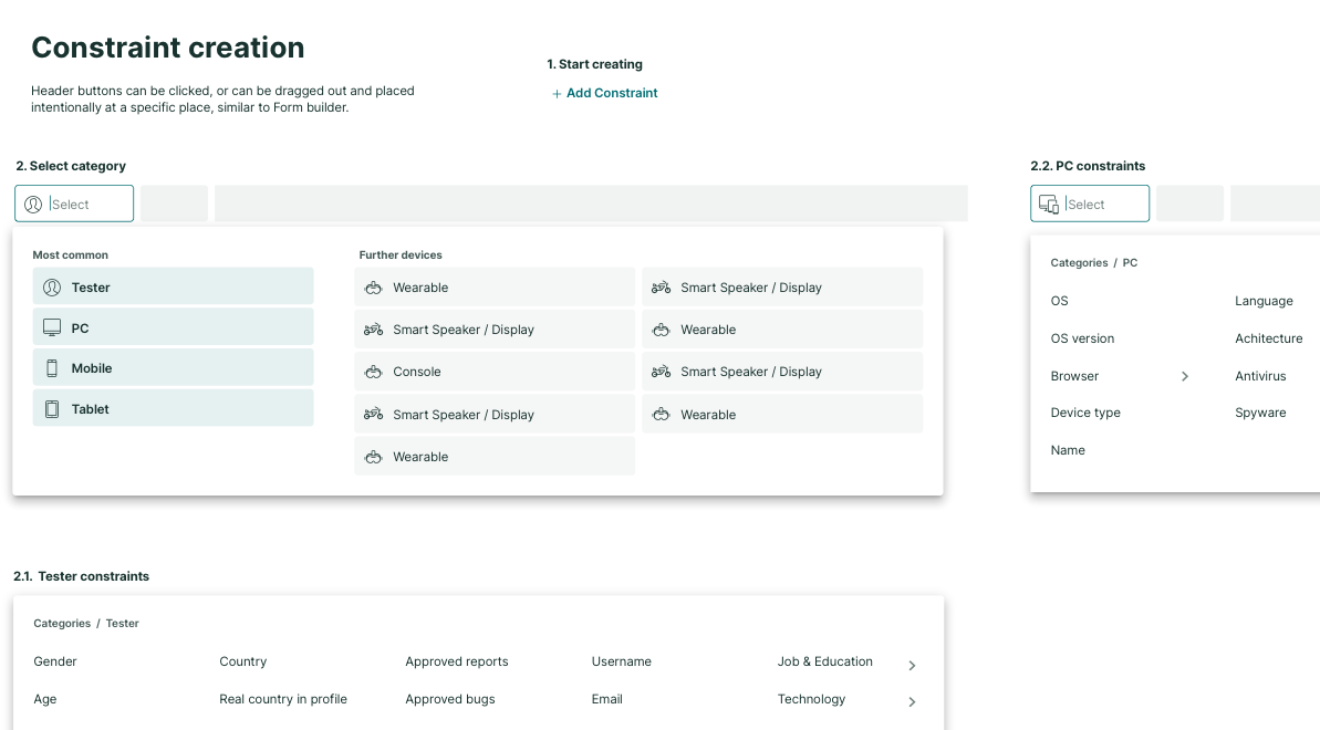
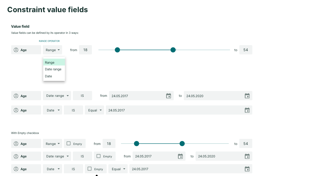
- constraint creation
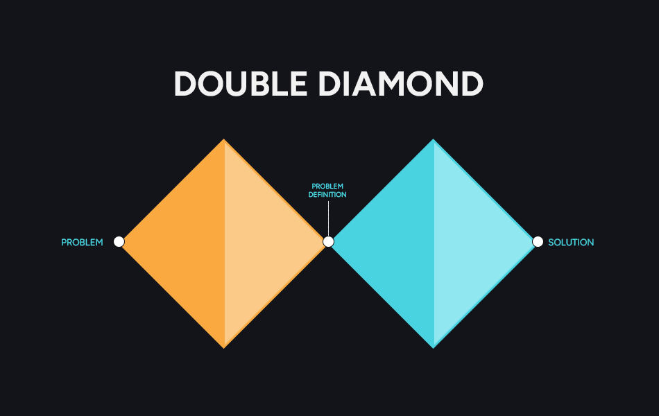
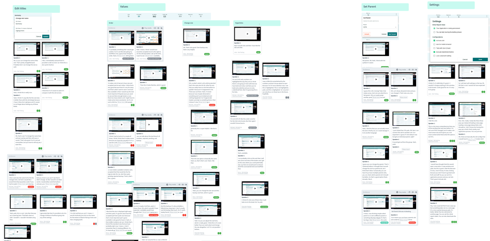
I conducted seven moderated usability tests to validate the design. Using the double diamond approach, I iterated after each round—fixing major issues and testing again. With each iteration, confusion decreased and confidence grew. Some testers felt uncertain at first due to years of using the old tool, but that bias faded quickly.
The strongest proof of success came when a tester created a new constraint effortlessly, without hesitation. This confirmed the design was intuitive, ergonomic, and ready for implementation.
Development & Implementation
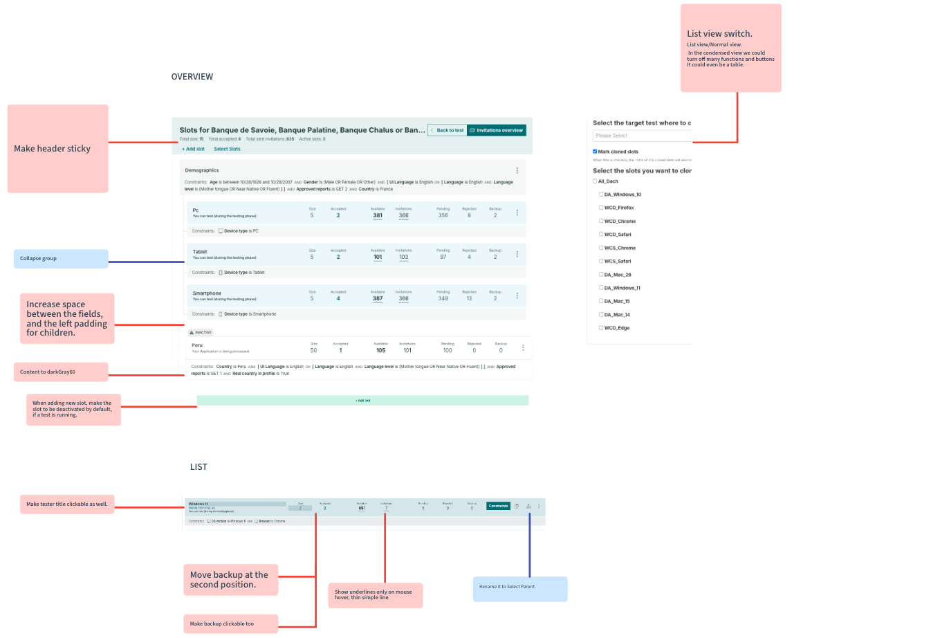
A detailed set of explanatory boards was prepared, covering every component, use case, edge case, and expected outcome.
One key lesson I’ve learned over the years is the importance of repeating and reinforcing knowledge about the product, users, goals, and system behavior. It’s easy to assume everything is clear because it’s documented, but in reality, the best way to keep everyone aligned is to review findings whenever a ticket is created or implementation begins.
Impact & Results
65%
Faster slot creation — PMs recreated complex structures 65% faster than before
Reduced Errors
Checking details and updating slots became faster, reducing manual errors
Moderated usability tests confirmed significant improvements. Users described the new list as cleaner, calmer, and easier to navigate, with less scrolling and clearer hierarchy thanks to color coding.
Validation & Findings
Appreciation
Camila
PMI like it. I like it a lot. I think this feature is so crucial to save time. So yeah, really happy if we can already start using it, that would be great.

Jan
PMI mean, just design wise, this is way calmer than the previous design was and I like that. I would feel comfortable to directly start working with this for you. And I think I wouldn't have many problems to get used to it, which which is a good thing.

Levi
PMThat's that's so much, so much better. Just feels more smooth to me. This was my first encounter with it, and it already feels comfortable to me. So I would feel comfortable, yeah, changing the view right now and using that going forward.
Julia
PMI really like the layout in general. It looks very clean and I think I get a good overview. I also think that there's more visible without scrolling, because it's more condensed