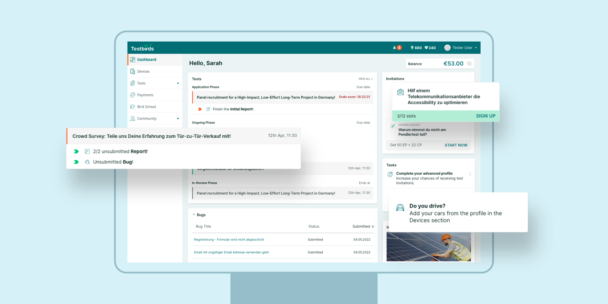
Our platform helps clients run and monitor user testing campaigns, providing insights through submitted reports, bug tracking, and analytics. A large number of testers contribute to these testing campaigns.
The dashboard serves as the central hub for testers. They look for new testing opportunities, stay informed, track ongoing tests, manage tasks, and monitor deadlines. The dashboard must cater to various user types based on experience: onboarding newcomers, providing essential information for regular testers, and offering an overview for power users.
Problem Statement & Background
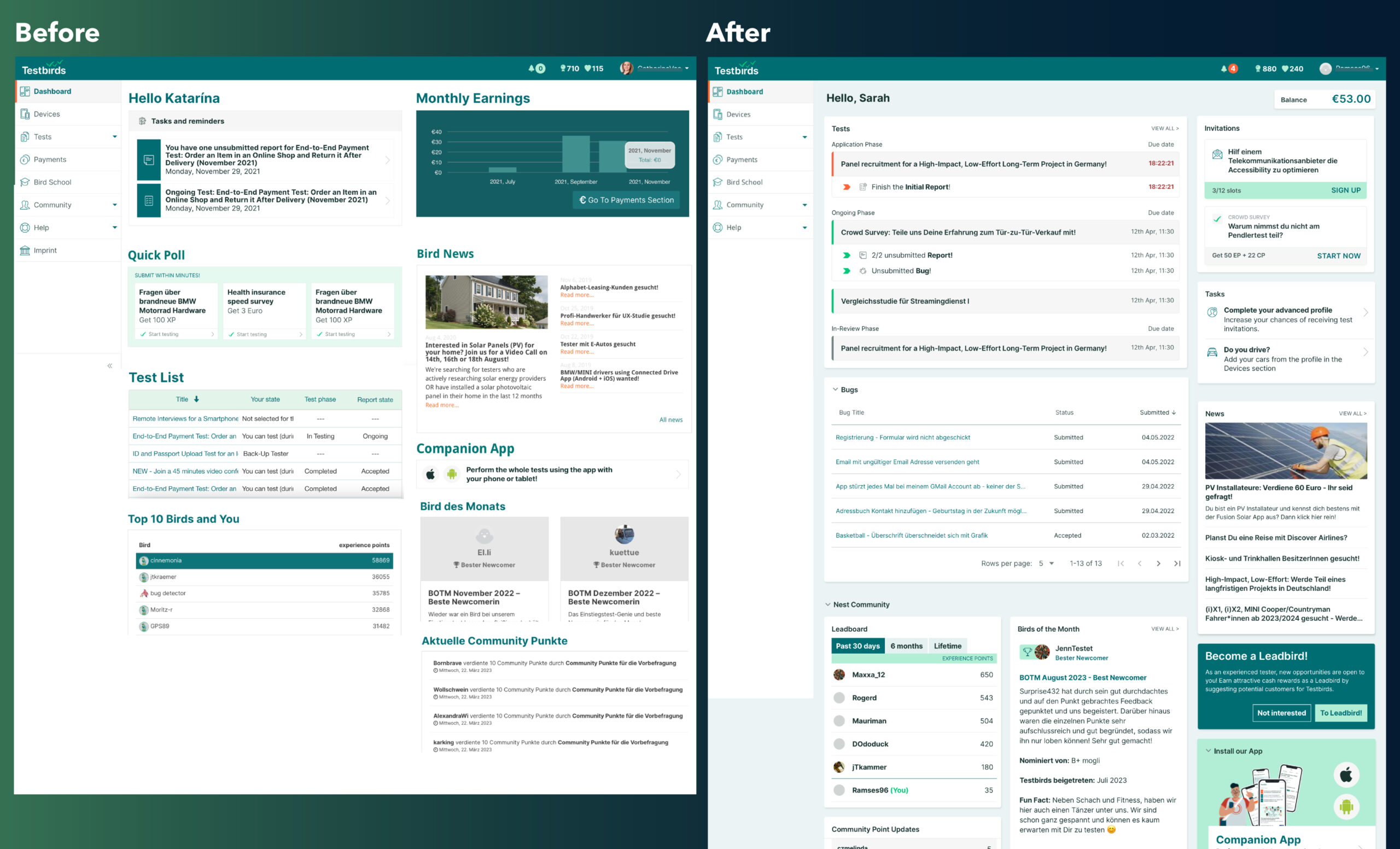
The dashboard was created over a decade ago using outdated Bootstrap technology, which imposed significant limitations. The redesign not only modernizes the technology but also improves loading times.
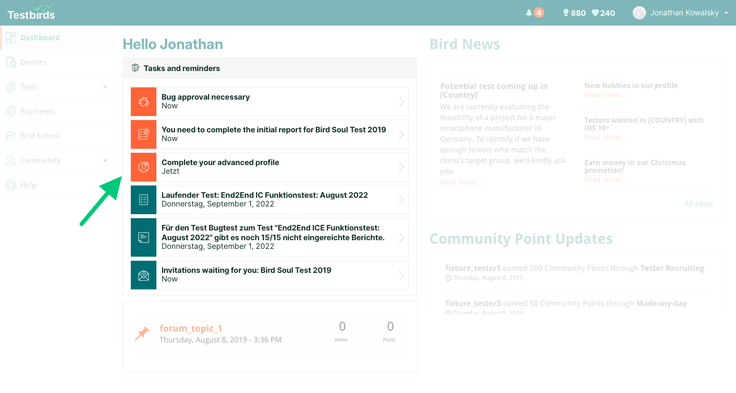
Testers frequently struggled to understand and prioritize urgent tasks. They lacked a clear deadline indicator and felt overwhelmed by the mixed visual styles and lack of hierarchy. The old dashboard did not effectively communicate relevant information.
Goals & Objectives
The primary goals of the redesign were:
Declutter
Declutter the dashboard and rebuild it to improve tester workflows.
Research-driven
Use research-driven insights to provide a meaningful test and task list.
Modernize
Modernize the interface to reflect the company's commitment to innovation.
Stakeholder Agenda
While user satisfaction was our primary focus, project managers also had key priorities:
Keep the news section visible, as it is a crucial recruiting tool.
Continue promoting the native app to facilitate tester engagement.
Prove that there is an active testing community, despite the absence of direct tester-to-tester communication.
Research & Discovery
User Interviews
We conducted seven interviews with testers, gathering valuable insights into their workflows.
Key findings:
The layout needed improvement, as testers found it chaotic and overcrowded.
A more structured and user-friendly design was required.
Testers wanted a personalized dashboard, focusing on ongoing tests, related subtasks, bugs, and tasks.
“I don’t care who gained what. I want relevant, personalized content.”
Quantitative Data
A survey with 420 testers validated the insights from interviews and helped assess the value of each existing dashboard component.
Recurring topics:
Clearly define deadlines for each task.
Provide more information on upcoming tests, including available spots.
Use a Kanban board-style layout for better progress visualization.
Offer a structured daily task overview.
Implement a calendar or timeline for ongoing tests.
Connect bugs to their corresponding tests.
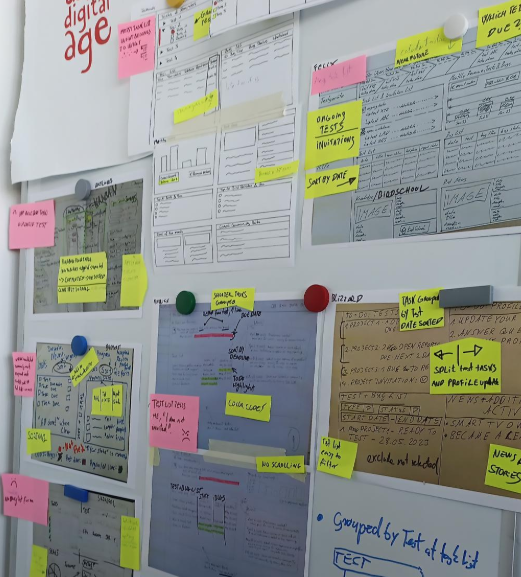
Wirefame ideas drawn by out testers
Wireframe Experiment
Eight testers were asked to answer quick questions and sketch their ideal dashboard layout. While these drafts were not used directly in the design, they provided us with a deeper understanding of their thought processes. Common ideas included:
Reducing information overload.
Displaying all key elements at a glance without excessive scrolling.
Sorting tests by due date.
Grouping subtasks under the test title.
Enhancing urgency with color coding.
Keeping test-related tasks separate from other dashboard content.
Merging test and bug lists.
Handling invitations separately from general to-dos.
Design Process & Challenges
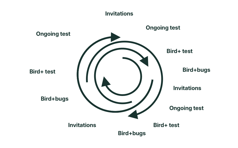
During ideation and drafting, our primary challenge was improving user workflow efficiency. Just as many professionals manage their tickets in the backlog, testers need an organized, structured ongoing test and task list.
Design considerations:
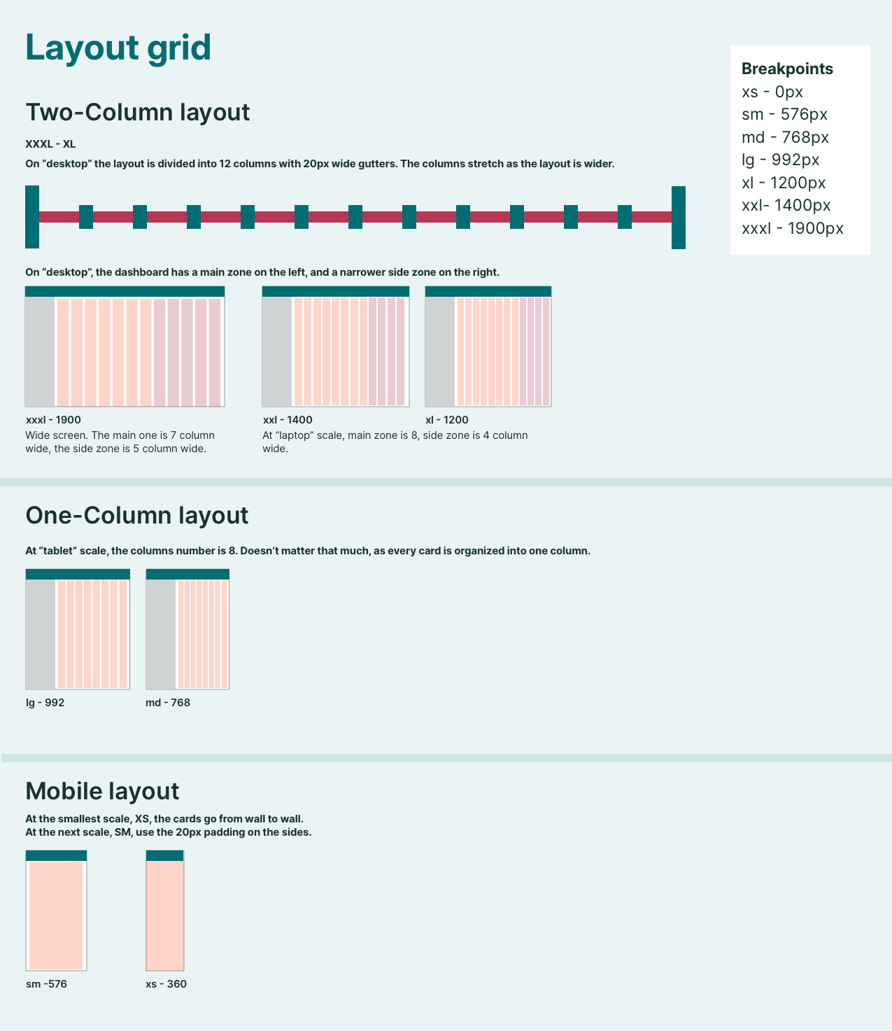
We began with a 1400px-wide layout, as laptops are the primary access device.
A classic 12-column grid was used for structuring components.
Multiple layout iterations were tested to determine the most effective approach.
Key challenges:
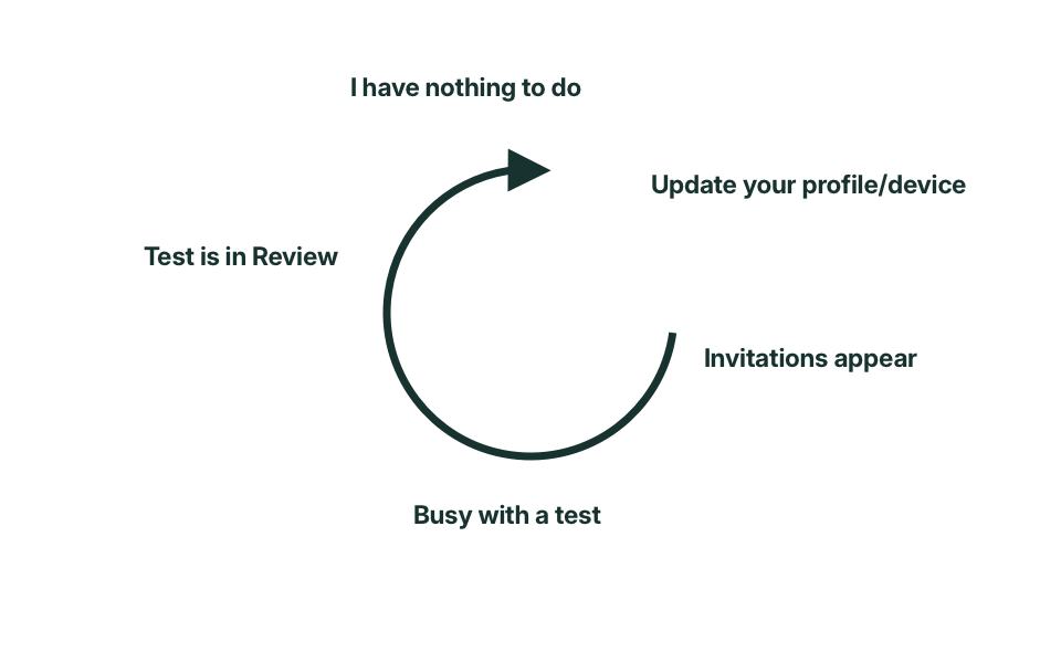
Designing for both empty and highly active dashboards.
Ensuring usability for testers with different experience levels (beginner, regular user, power user).
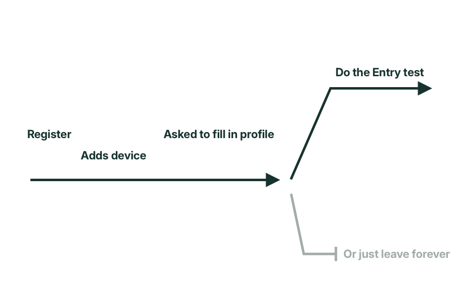
Onboarding new user
Common user
Heavy user
Adopting the Interface
Tasks
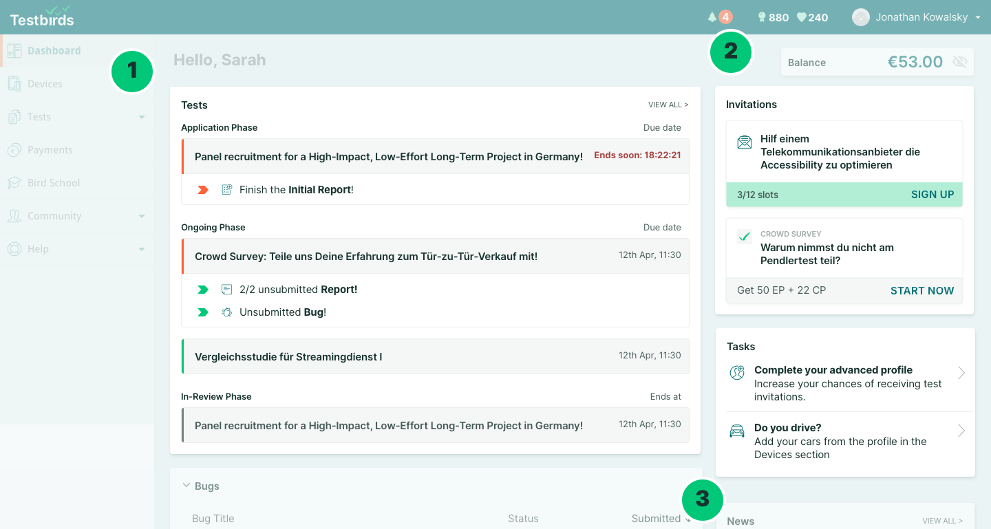
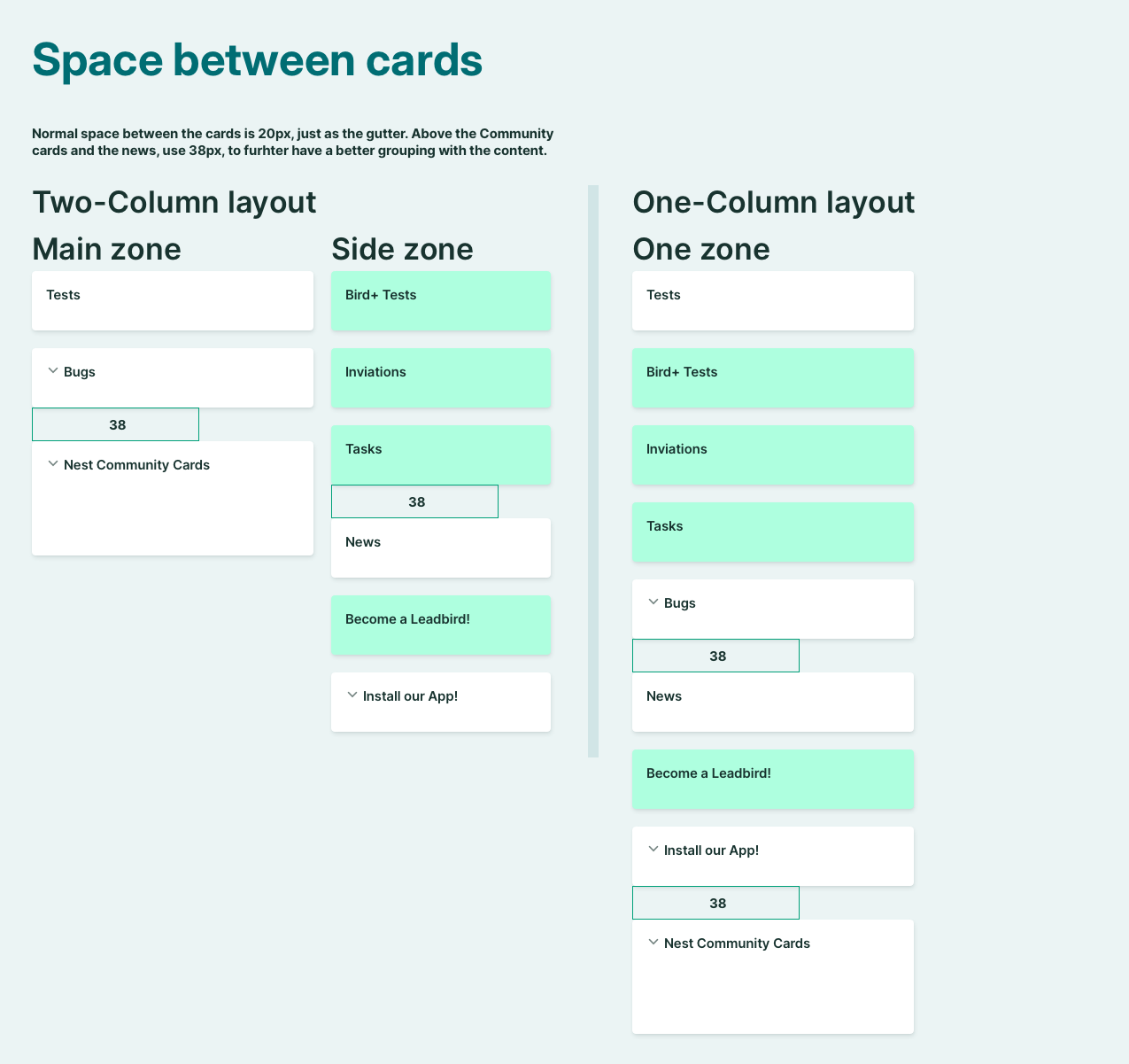
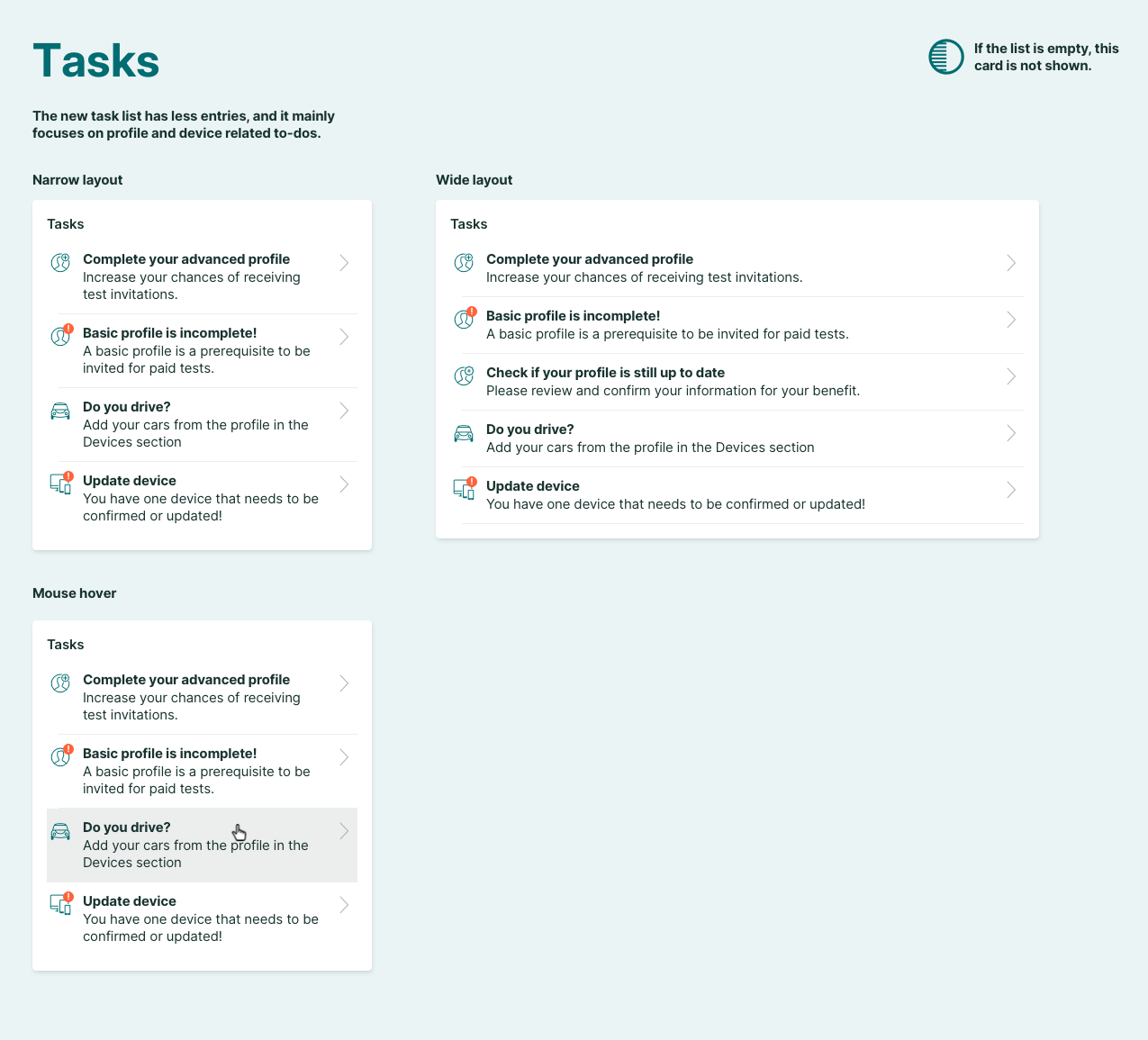
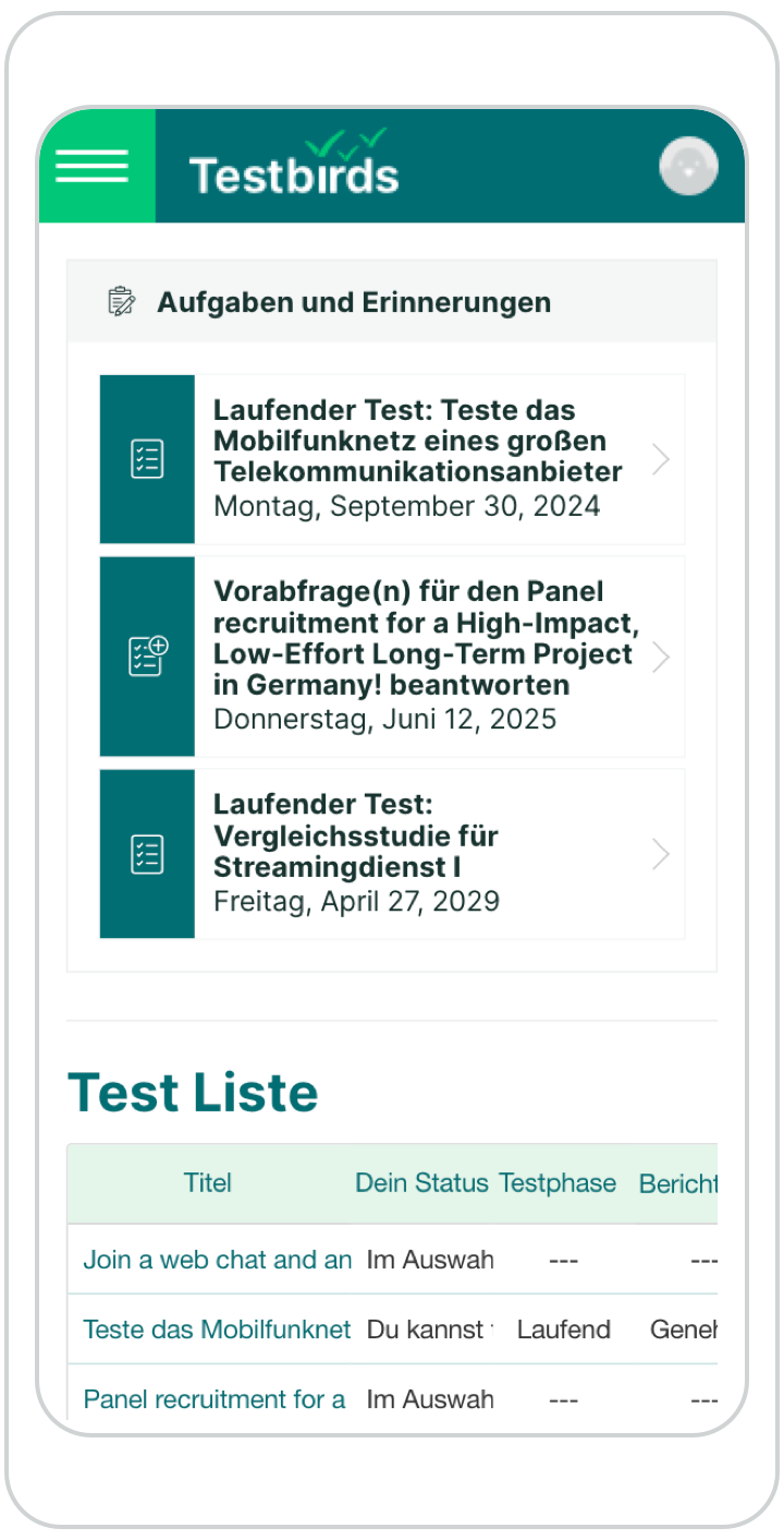
Previously, all tasks were listed in a single, cluttered list. The redesign categorized tasks into distinct cards based on content:
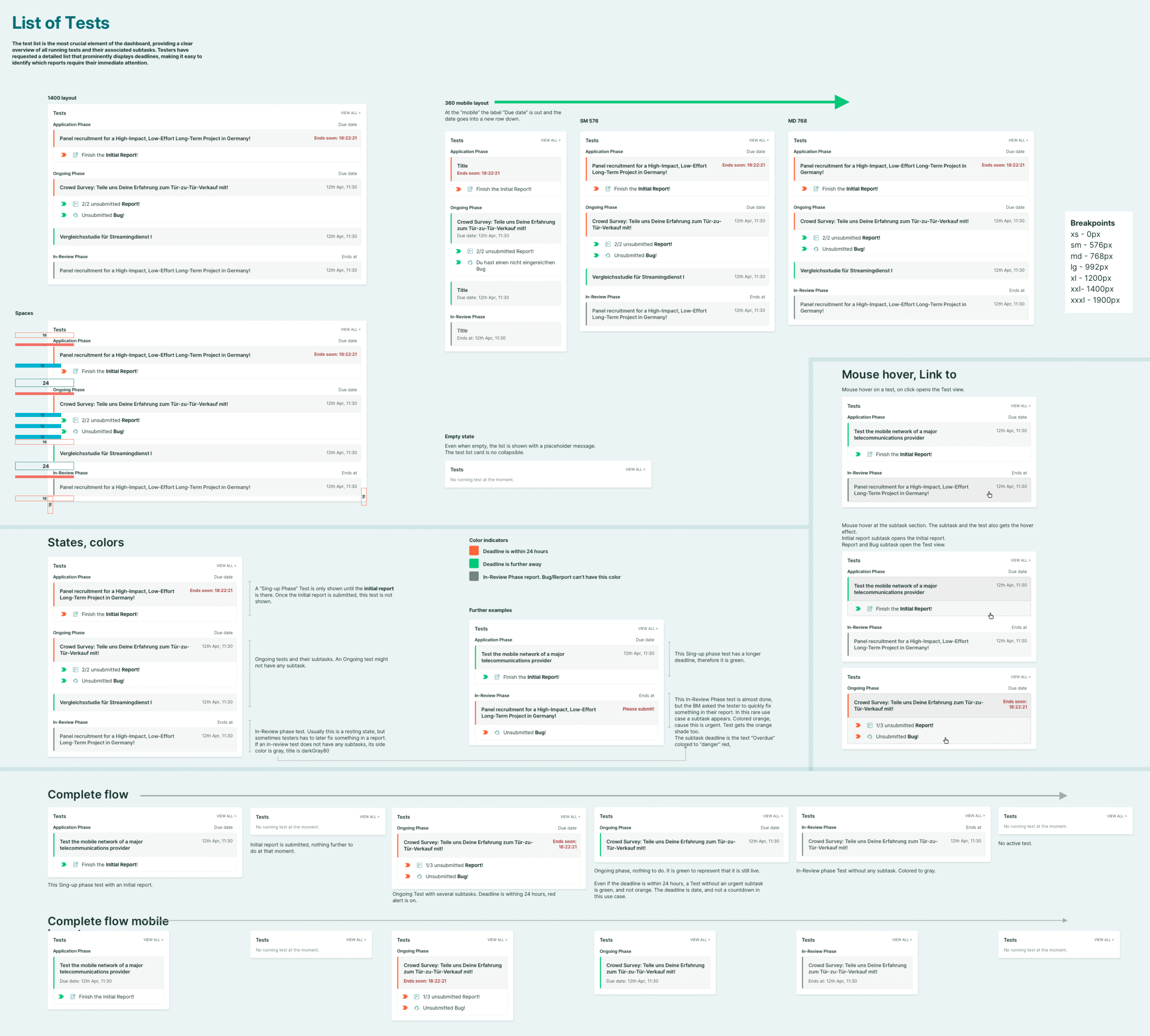
Tests and reports
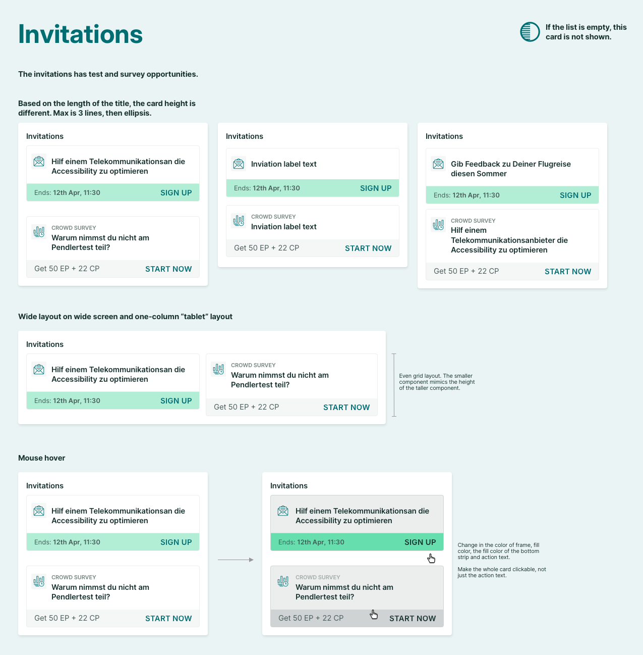
Invitations
Profile related tasks
To prevent unnecessary screen clutter, empty cards are automatically removed when no relevant tasks are present. Each layout scenario was tested for usability.
Old dashboard with mixed tasks
Task separated based on content
Onboarding
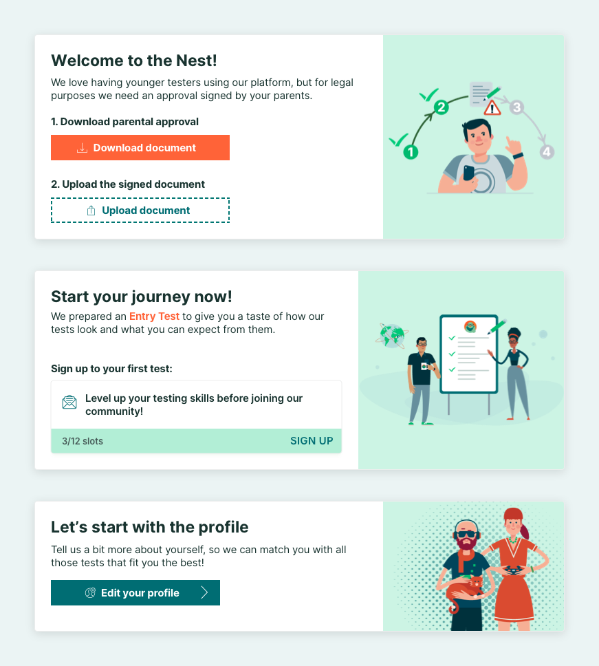
New users often feel lost upon first login. Instead of traditional step-by-step guides, we implemented large, prominent cards at the top of the dashboard. These “onboarding cards” clearly communicate the next task in a friendly manner.
Development & Implementation
After extensive design work, detailed documentation was created for the front-end team. This included explanatory boards for each component. Collaboration with the front-end team ensured:
Consideration of all potential use cases and error scenarios.
Adaptability to different breakpoints and layouts.
Continuous design iteration based on development feedback.
The design process did not end with the handoff. I actively participated in testing, reviewing UI implementations, and providing real-time feedback to ensure consistency between design and development.
Holistic Product Design
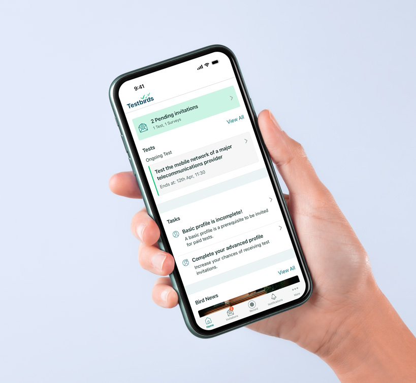
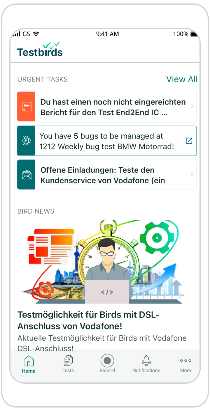
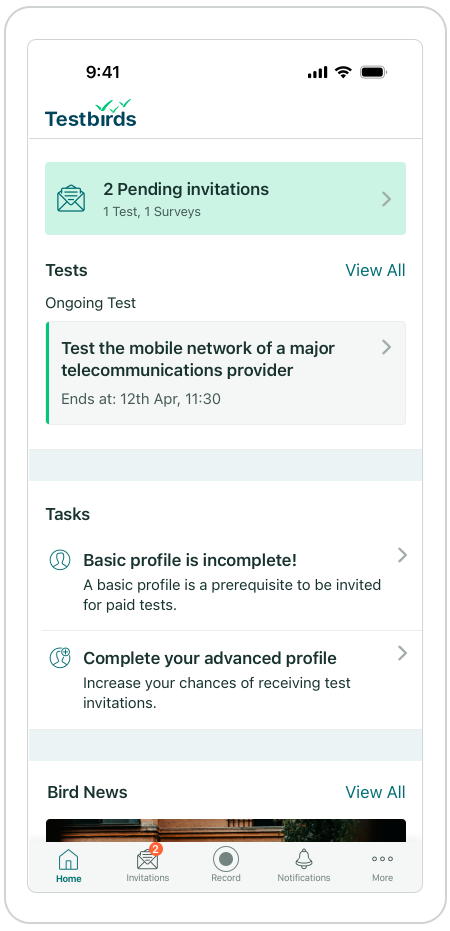
Alongside the web app redesign, the native mobile app’s dashboard also received updates for consistency. The goal was a lighter but visually aligned solution.
A follow-up survey of 540 testers evaluated the effectiveness of the mobile dashboard. User feedback helped refine aspects of the test list even while web development was ongoing. The results provided further insights to refine the design, mainly the test list.
Old Web-view
Old Native App
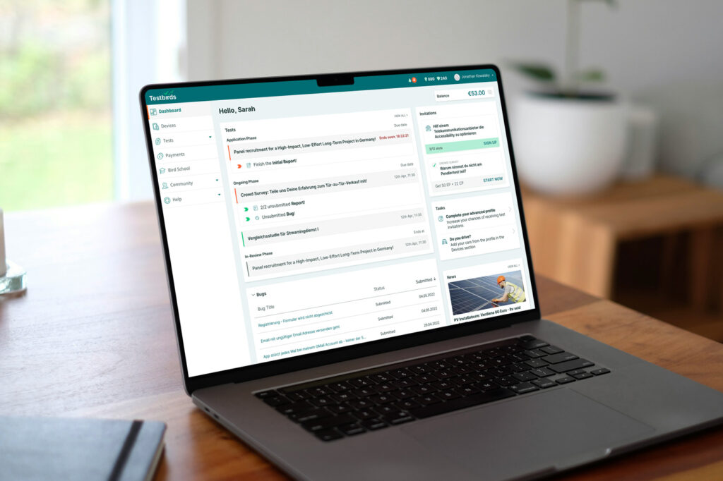
New Web-view
New Native App
Testing & Validation
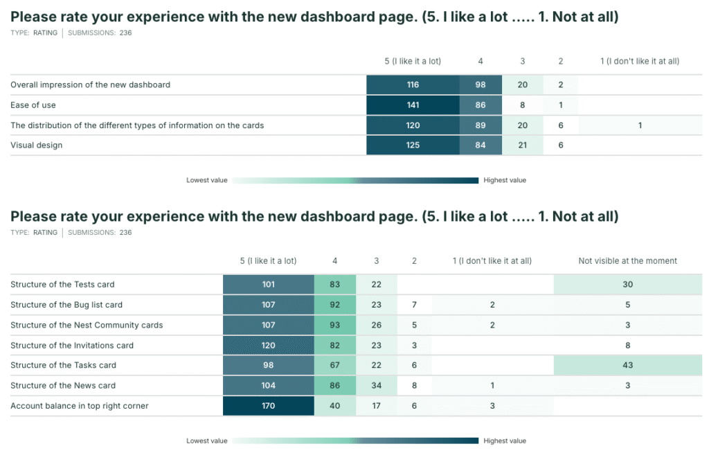
After many sprints and multiple bug fixes, 240 testers reviewed the Beta version and provided feedback through a survey.
Success was measured through multiple metrics:
First impressions: Testers described the new dashboard using adjectives.
Test list functionality: Users rated the test list and provided positive/negative feedback.
Component satisfaction: Testers rated each feature individually.
Open-ended feedback: Users shared suggestions and creative ideas.
Popular features
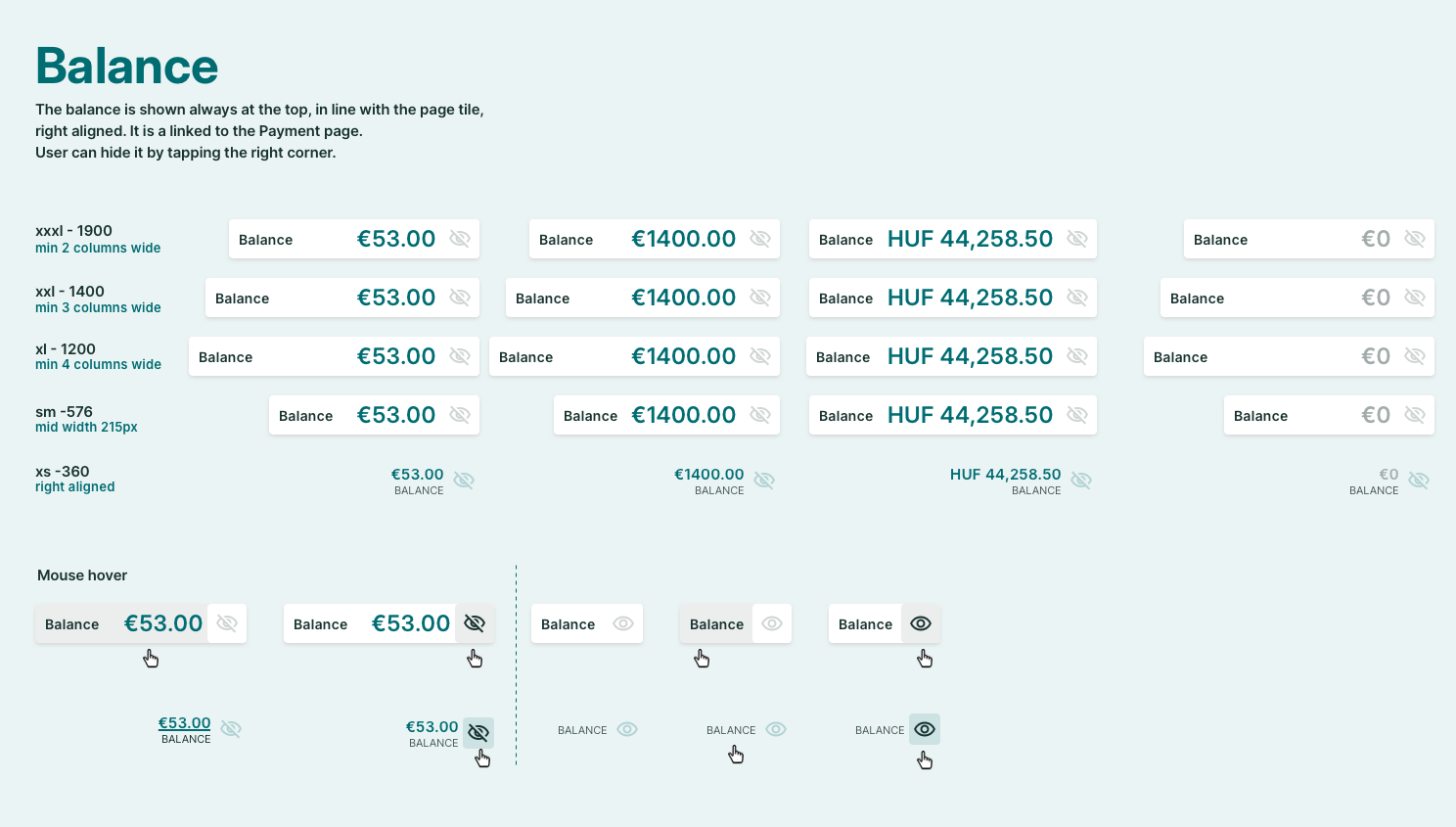
Direct visibility of account balance.
Better test and invitation overview.
Clear sections for tasks, earnings, and notifications.
Modern design elements and color schemes.
Reduced scrolling with compact information display.
Quick access to essential features like news and invitations.
Quotes
I like the overview. Looks modern, good, and helpful. I’ve been a tester since 2014, and this fresh design is very welcome.
The UI is fascinating. Everything is displayed on a single page without excessive toggling.
It is clear and helpful to quickly see ongoing tests. It is also clear what you still have to do in the ongoing tests
First impression adjective summary
320 Positive Adjectives
clear: 45
clean: 30
modern: 20
organized: 18
intuitive: 15
user-friendly: 12
simple: 10
structured: 10
useful: 8
easy: 8
20 Negative Adjectives
confusing: 5
chaotic: 3
indifferent: 2
plain: 2
empty: 2
crowded: 2
convoluted: 2
bland: 1
strict: 1
not impressive: 1
Iteration
Quick Fixes
User-reported bugs and UI inconsistencies were addressed in the following weeks. A particularly interesting request involved the new account balance component. While users appreciated its inclusion, multiple testers requested an option to hide it in certain scenarios—similar to banking app privacy features.
Future Plans
Testers proposed feature ideas to be included on the dashboard, such as usage statistics, relevant blog posts, and advanced task management. While the immediate focus was on bug fixing and usability improvements, these ideas are noted for potential future updates. The priority is allowing users time to adapt to the new interface before introducing further enhancements.
Impact & Results
As a service-oriented company, it’s essential to demonstrate continuous evolution and modernization. The redesign successfully addressed usability concerns and improved tester satisfaction.
Key takeaways:
The new dashboard is clearer, more structured, and functionally superior.
Users appreciate the improved interface and enhanced usability.
The redesign reinforces our commitment to providing a modern, efficient testing experience.