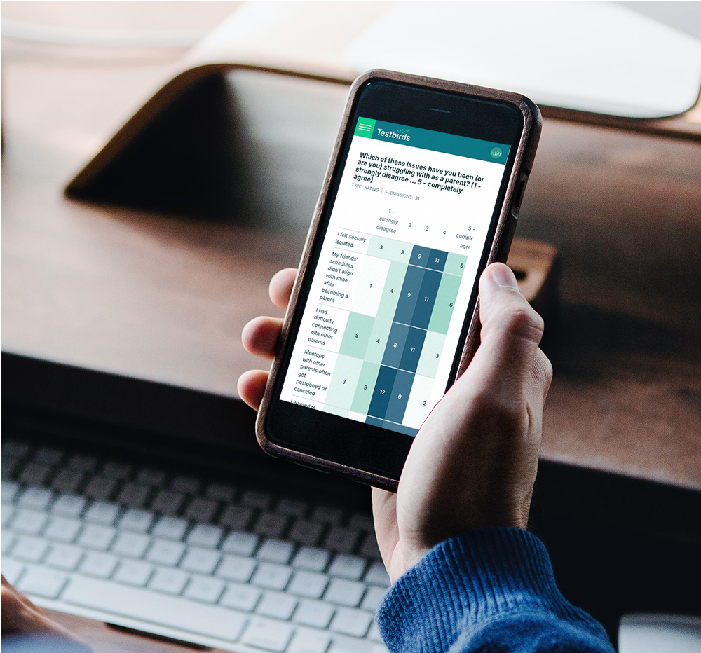
Our platform helps clients run and monitor user testing campaigns, providing insights through submitted reports, bug tracking, and analytics. Some clients are highly engaged, actively communicating with testers and validating reports, while others take a more passive approach, checking in occasionally.
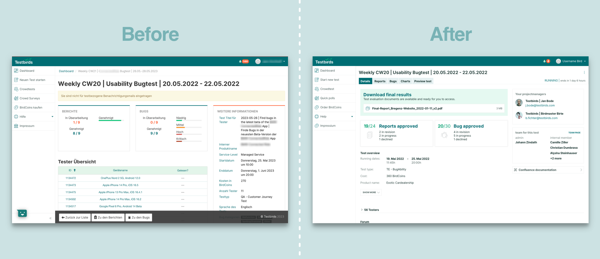
The test overview was outdated, and this led to a complete redesign, addressing usability pain points, modernizing the interface, and refining navigation to support different user workflows.
Project Scope & Background
Clients rely on the test overview to track their campaigns, but usability issues were causing frustration. Feedback from user interviews revealed key problems:
The interface felt outdated compared to modern tools.
The structure of the overview was unclear, making it difficult to process reports and bugs.
Finding relevant information quickly was a challenge, especially for clients who were deeply involved in processing data.
The goal was to improve navigation and create a more intuitive layout that caters to both active and passive users.
Challenges
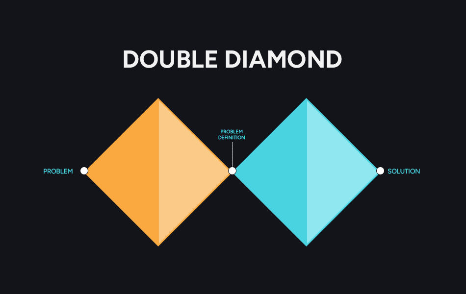
Designing a modern, user-friendly interface while staying within technical constraints required close collaboration with engineers. I had to constantly balance:
Usability Goals
What must be done to improve usability.
Reasonable Compromise
What can be done given development limitations.
Navigation
An inconsistent navigation structure was an obstacle. Untangling and reorganizing these elements was a key challenge.
User Research & Insights
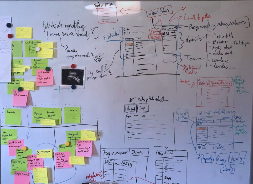
We conducted stakeholder interviews, user research, and usability tests to understand pain points. Findings showed that navigation, information architecture, and data management needed a complete overhaul.
To map out existing functionalities, we:
Analyzed how clients interacted with the test overview.
Listened to their workflow stories.
Identified redundancies and inconsistencies in navigation.
Studied modern tools like Atlassian and Google products for inspiration.
Synthesizing & Defining Priorities
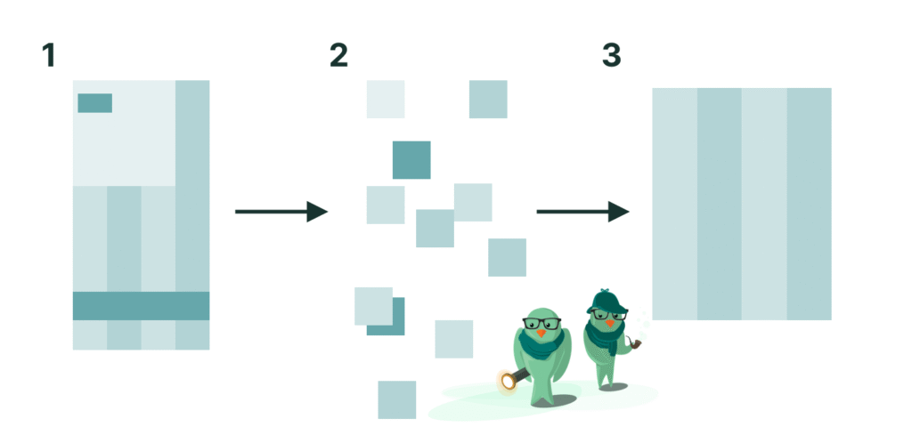
With the research findings, I created an Affinity Diagram and a Feature Priority Matrix to define the core improvements:
Active clients needed better ways to manage, accept, and track reports and bugs.
Less-involved clients needed a clearer information hierarchy and discoverable subpages.
Navigation Overhaul
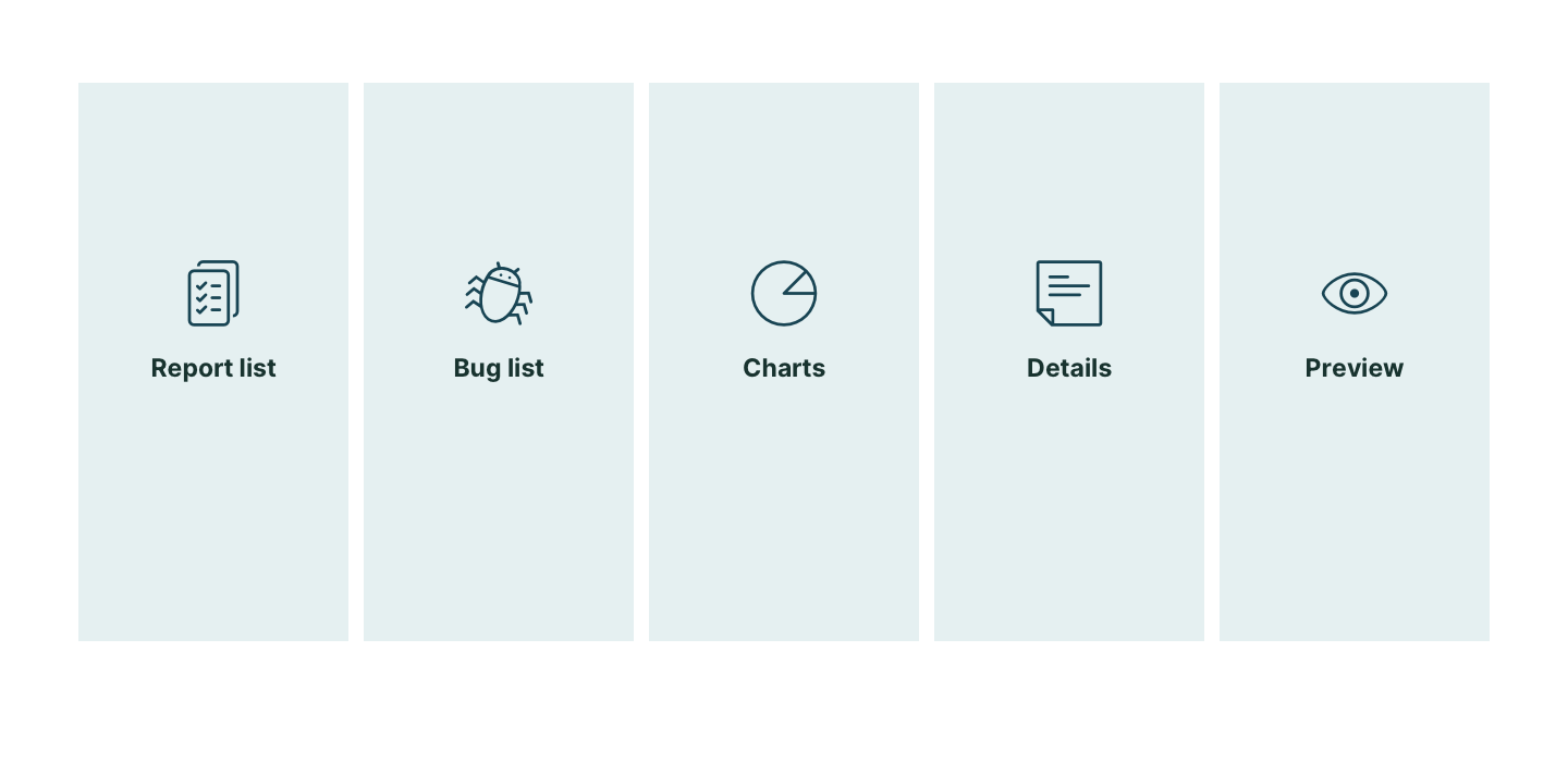
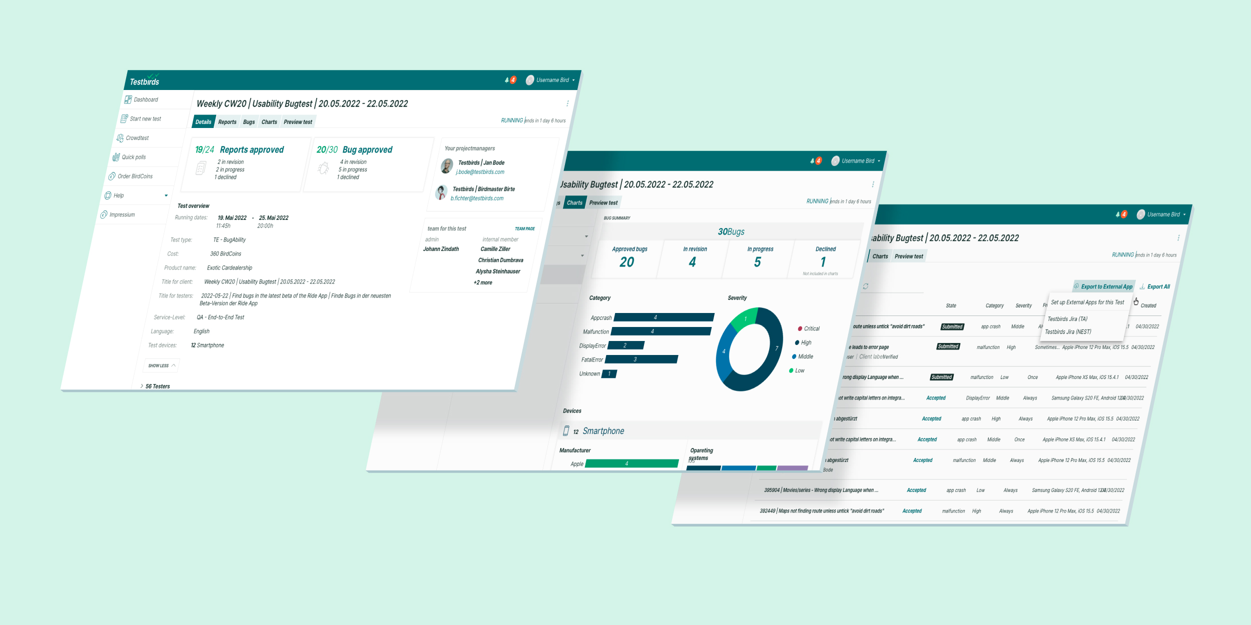
A major breakthrough was restructuring the test overview into five core tabs:
🔹 Details – Key test campaign information. 📄 Reports – List of submitted reports. 🐞 Bugs – Tracked issues and errors. 📊 Diagrams – Data visualizations and key insights. 👀 Preview – A test participant’s perspective.
This tab-based navigation system made it easier to move between sections and quickly locate relevant information.
Overcomplicated legacy solution
Clearing out the core structure
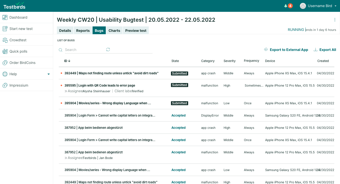
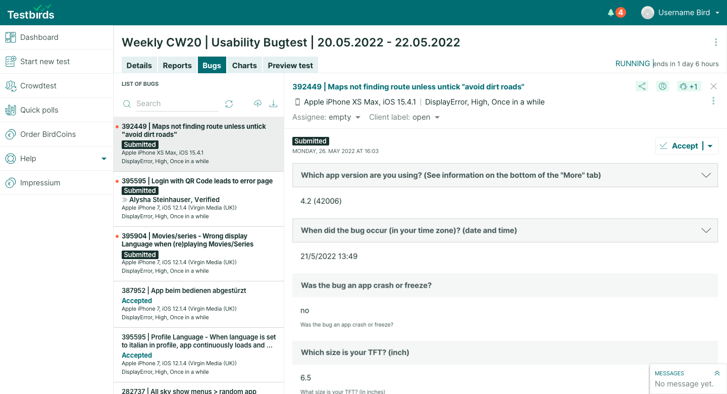
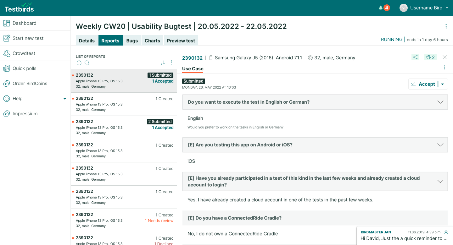
Another major enhancement was the dynamic grid for reports and bugs. Instead of opening a new page for each entry, the new layout splits the screen—a list view on the left, a detailed report view on the right, similar to Jira’s issue tracking system.
List view
After selecting an entry, divided detailed view
Hi-Fi Prototyping & User Testing
With a high-fidelity prototype, we conducted remote moderated usability tests with a diverse range of clients.
Instead of surveys, each test was live, ensuring we captured detailed insights from different client types:
Active users
Beginners
Passive observers
We aimed to eliminate inconsistencies and establish a clear, standardized terminology and symbol system. The goal was to create a future-proof solution that could be easily expanded and built upon in the coming years.
Testing and updating the design was an iterative process:
Tested a version →
Gathered feedback →
Refined the design →
Tested again →
Development & Handoff
I prepared the final design files for engineering, ensuring a smooth handoff by:
Documenting all use cases, layout rules, and states, linked to Jira tasks.
Holding handover calls to clarify design decisions.
Iterating with developers to cover additional use cases as they surfaced.
Since this feature had to be somewhat responsive, we ensured it worked on wide screens and laptops while maintaining usability on tablet-sized devices. Some aspects were even accessible on mobile for on-the-go use.
Report-Level Navigation
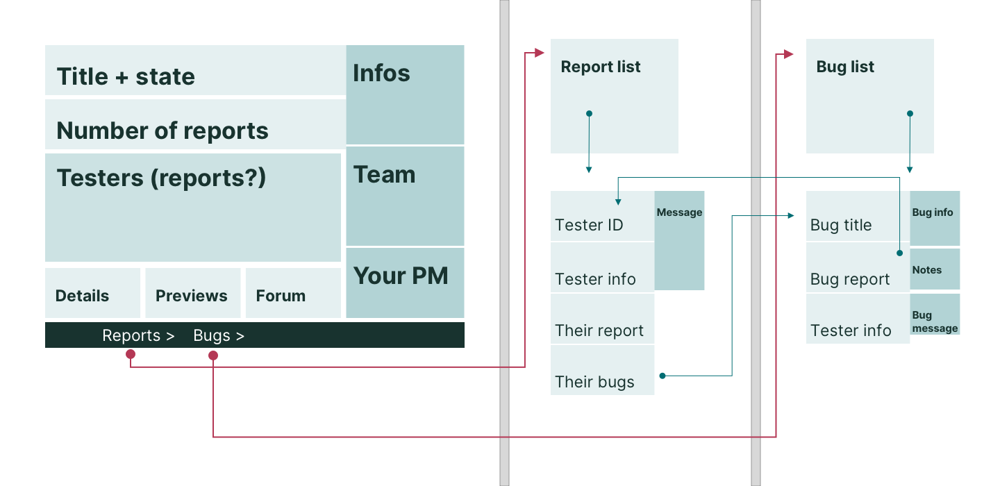
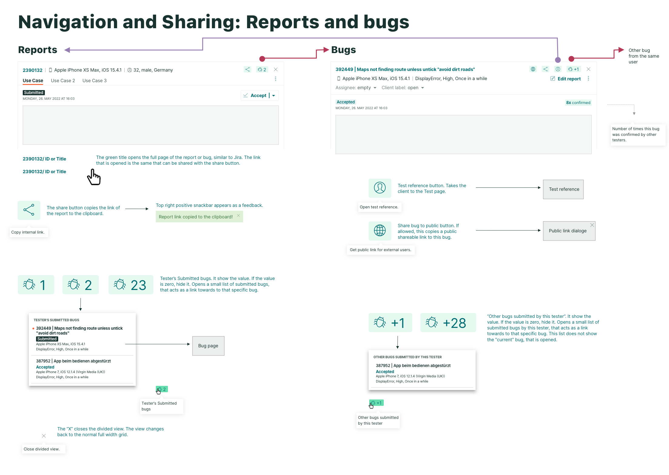
Clients appreciated the tab-based high-level navigation but also wanted an easy way to switch between reports and bugs submitted by the same tester.
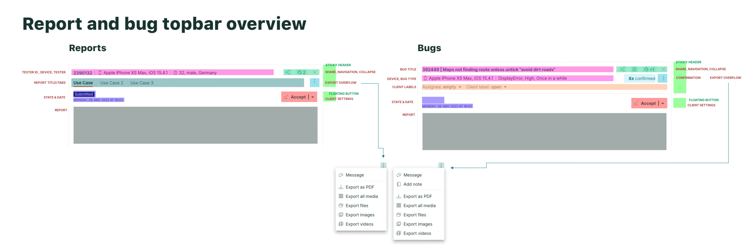
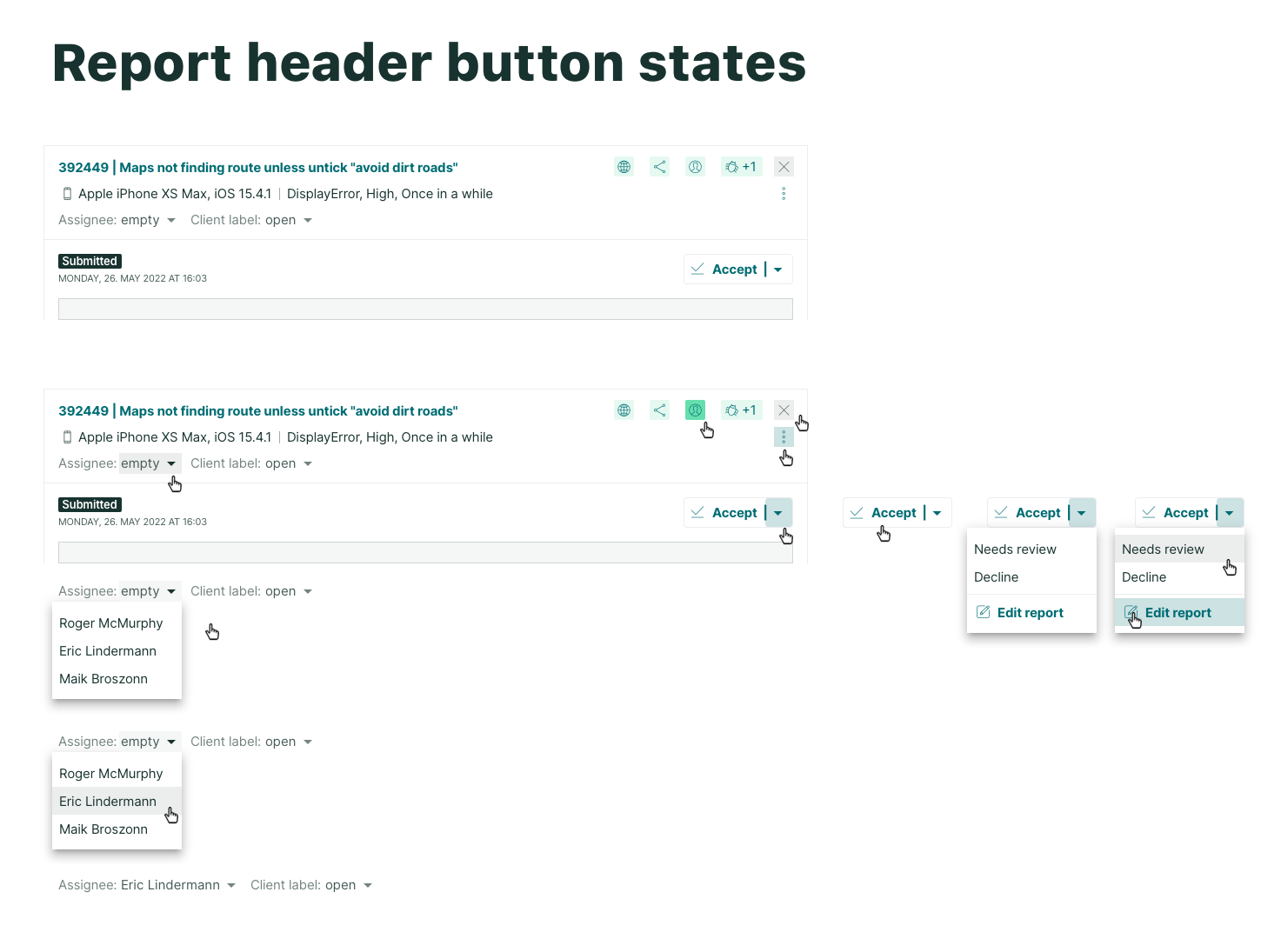
To address this, both the report and bug detail views were designed with a consistent header structure and small navigation hooks, allowing users to move seamlessly between the two.
Positioning all functionalities while keeping the interface user-friendly was a challenge, but testing confirmed that clients understood the logic. Additionally, using similar patterns for lists and header components simplified development and ensured consistency.
Report details
Bug details
Component explanation boards:
Impact & Takeaways
🚀 Clients loved the improved test overview, appreciating how much easier it was to check test campaign details. The redesign gave it a modern, polished feel, reinforcing trust in our company’s technology.
Appreciated Features
Clearer navigation made it easier to move between test sections.
The split-view layout significantly improved efficiency when reviewing reports and bugs.
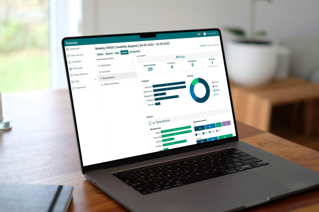
Data visualization through new diagrams helped clients grasp key test findings faster.
Ultimately, this redesign not only improved usability but also strengthened our company’s reputation as an innovative and user-focused testing platform.